
This is the final cut for our trailer we modified based on the audience feedback we received.
Wednesday, 31 March 2010
4. How did you use media technologies in the construction and research, planning and evaluation stages?
In order for our group to produce the media project to the best of our ability .we used a variety of media technology including; Photoshop, adobe after effects and adobe premiere pro. We also used some very sophisticated filming equipment which josh reeves already had purchased for out of school purposes we took advantage of this in order to make the best media project we could. We used a Canon xm2 camera and a boom mike in order to help us get better sound quality.
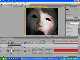 The most important piece of media technology we used was adobe after effects this helped the group to take the clips we filmed at the shoot and alter them so that they gave off the kind of tension we wanted to create in order to appeal to our target audience. After effects is a program designed to alter clips that we have filmed and add effects to them such as the demon face that you see at the end of the trailer. This made it a crucial piece of technology if we wanted to create the desired effect. This meant that if we did not have this technology then it would have been much harder for us to get the desired effect and would most likely have led to us having to change our strategy and come up with a new plot which would cater more to the technology we could use. After effects was another program that was owned by josh. Creating the demon was not the only use for after effects it also had another use and that was transforming the shots that were done in very low lighting and making it so that you could clearly see the face of the father when he is searching the house using the torchlight to illuminate his face. If we did not have the ability we would most likely have had to change our story to accommodate for only being able to film during the day. One of the key things we used in after effects was motion tracking this helped us to create our demon face because the tracking ensured that the effects that we applied to the face would follow it as the face moved forward in order to create the lunge effect. We also used after effects to create the production titles that you see at the beginning of the trailer these helped to add a professional look to our trailer and make it fell more like it could exist in the film industry.
 Another piece of crucial technology was Photoshop we used this in order to make our ancillary tasks which included a magazine front cover including our film and a poster for our film as I outlined earlier in the evaluation. Photoshop is a program designed to help the user alter still images to improve and add to them in order to get the desired effect. It is seen as industry standard in media and is used by a lot of media firms. Photoshop was key for our group because it helped us to make the best poster and magazine front cover using the variety of tools that are available on Photoshop. If Photoshop was unavailable then we would have had to use a different program in order to create our ancillary tasks for example Paint shop which does not have as many tools as Photoshop.
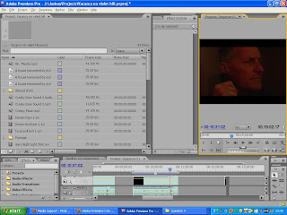 The other piece of technology that we used was adobe premier. This is primarily a program like final cut it is used to make small changes to clips such as changing the brightness of a shot. It is also used to take the clips and put them together making a coherent film also the group used it to add the copyright free music we had chosen in order to help to convey the theme and tension that we were hoping to create in the trailer. We also used it to combine all of the different sounds that we recorded as a wild track. Whilst adobe premiere was used to put our trailer together it would have been likely that we could have used final cut in order to put the clips and sound together. However premiere pro was useful because it linked nicely with adobe after effects making it easier to compile all of the clips and music.
 The most important piece of media technology we used was adobe after effects this helped the group to take the clips we filmed at the shoot and alter them so that they gave off the kind of tension we wanted to create in order to appeal to our target audience. After effects is a program designed to alter clips that we have filmed and add effects to them such as the demon face that you see at the end of the trailer. This made it a crucial piece of technology if we wanted to create the desired effect. This meant that if we did not have this technology then it would have been much harder for us to get the desired effect and would most likely have led to us having to change our strategy and come up with a new plot which would cater more to the technology we could use. After effects was another program that was owned by josh. Creating the demon was not the only use for after effects it also had another use and that was transforming the shots that were done in very low lighting and making it so that you could clearly see the face of the father when he is searching the house using the torchlight to illuminate his face. If we did not have the ability we would most likely have had to change our story to accommodate for only being able to film during the day. One of the key things we used in after effects was motion tracking this helped us to create our demon face because the tracking ensured that the effects that we applied to the face would follow it as the face moved forward in order to create the lunge effect. We also used after effects to create the production titles that you see at the beginning of the trailer these helped to add a professional look to our trailer and make it fell more like it could exist in the film industry.
 Another piece of crucial technology was Photoshop we used this in order to make our ancillary tasks which included a magazine front cover including our film and a poster for our film as I outlined earlier in the evaluation. Photoshop is a program designed to help the user alter still images to improve and add to them in order to get the desired effect. It is seen as industry standard in media and is used by a lot of media firms. Photoshop was key for our group because it helped us to make the best poster and magazine front cover using the variety of tools that are available on Photoshop. If Photoshop was unavailable then we would have had to use a different program in order to create our ancillary tasks for example Paint shop which does not have as many tools as Photoshop.
  The other piece of technology that we used was adobe premier. This is primarily a program like final cut it is used to make small changes to clips such as changing the brightness of a shot. It is also used to take the clips and put them together making a coherent film also the group used it to add the copyright free music we had chosen in order to help to convey the theme and tension that we were hoping to create in the trailer. We also used it to combine all of the different sounds that we recorded as a wild track. Whilst adobe premiere was used to put our trailer together it would have been likely that we could have used final cut in order to put the clips and sound together. However premiere pro was useful because it linked nicely with adobe after effects making it easier to compile all of the clips and music.
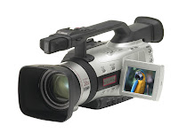
We used the camera and sound equipment to film and record the wild tracks that we needed for our trailer. This camera is different to the ones that were provided by our media teacher. Although the cameras provided by our media teacher are very good the camera available to us gave better quality and more options such as a manual focus system that can be used to perform focus pulls also the option to change exposure and other options which help to film at night. Below is a picture of the camera we used.

2. How effective is the combination of your main product and ancillary tasks?
For our main task we chose to create a film teaser trailer whilst we also chose to create a magazine front cover featuring the film and a poster for the film. In order to make an effective combination of our main and ancillary tasks we need to consider the different themes that we wanted to present in the trailer and convey them into our print product. It is hard to switch themes such as music from trailer to print so we decided to use imagery because we could easily achieve the same feel in a film and print when looking at imagery.
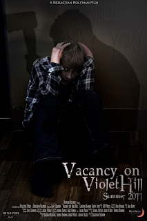 We needed to convey these themes in our movie poster we had to do this using imagery mainly which was the convention that we saw a lot of other posters use. We used an image of the son kneeling up against a wall obviously scared we also had someone standing over him with an axe however it is unclear who it is helping to create ambiguity we also faintly show the text ‘I will bury you’ etched into the wall this helps to create tension in the image. We also keep the central theme of the demon by giving the son a catlike eye which helps to make him look less human. This helps to keep the themes we showed in the trailer and also to conform to convention where normally only one or two characters are shown in a poster and not a lot is said. These themes also help to ensure we appealed to our target audience.
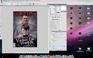
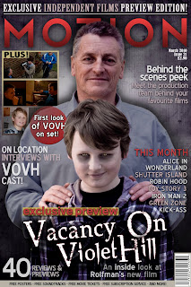 We also needed to create these themes in our magazine front cover whilst also appealing to the target audience of the magazine. The target audience for a magazine is different to that of the film and we did extra research into this looking at other film magazines and what target audience they have and the conventions they used. In our research we noticed a lack of magazines covers with horror films on the front. We realised that this is because horror films have more of a niche audience and are not mainstream enough for larger magazines. We decided to then give our magazine a niche market which is British film lovers we did this by adding features about British films and independent films as well. This allowed us to give better reason for having our film on the cover because it is a British independent film. After identifying our target audience we got more of an idea about what to include on the cover. We realized that the image was central for the cover and we chose to use the same kind of themes as the poster. We took an image of a what looks like a family photoshoot with the father and son and whilst the father is smiling the son looks sinister and we give him a demonic face. This helps to keep the demon theme throughout all 3 products it also helps in making the reader curious.
We saw it was important to ensure that our target audiences were the same between the three products so we decided to research into films that shared a similar target audience such as the grudge and the Amityville horror. We saw that they shared a similar target audience of teens through to young adults. We looked at the trailers for these films and clips from the films themselves. We also looked at the posters released with the films studying the conventions used in both. However there was a short supply of magazine front covers which showed horror films.
Our main product was a teaser trailer for the horror film ‘Vacancy on violet hill’. After researching forms and conventions involved in all films we studied horror films such as the grudge and the ring looking at the editing mise - en- scene lighting and much more. This helped us to understand what we needed to do for our trailer. We looked at all of these things and manipulated them to give of the theme and ideas we wanted to convey in our trailer. Some of these themes were tension curiosity and ambiguity.
 We needed to convey these themes in our movie poster we had to do this using imagery mainly which was the convention that we saw a lot of other posters use. We used an image of the son kneeling up against a wall obviously scared we also had someone standing over him with an axe however it is unclear who it is helping to create ambiguity we also faintly show the text ‘I will bury you’ etched into the wall this helps to create tension in the image. We also keep the central theme of the demon by giving the son a catlike eye which helps to make him look less human. This helps to keep the themes we showed in the trailer and also to conform to convention where normally only one or two characters are shown in a poster and not a lot is said. These themes also help to ensure we appealed to our target audience.
 We also needed to create these themes in our magazine front cover whilst also appealing to the target audience of the magazine. The target audience for a magazine is different to that of the film and we did extra research into this looking at other film magazines and what target audience they have and the conventions they used. In our research we noticed a lack of magazines covers with horror films on the front. We realised that this is because horror films have more of a niche audience and are not mainstream enough for larger magazines. We decided to then give our magazine a niche market which is British film lovers we did this by adding features about British films and independent films as well. This allowed us to give better reason for having our film on the cover because it is a British independent film. After identifying our target audience we got more of an idea about what to include on the cover. We realized that the image was central for the cover and we chose to use the same kind of themes as the poster. We took an image of a what looks like a family photoshoot with the father and son and whilst the father is smiling the son looks sinister and we give him a demonic face. This helps to keep the demon theme throughout all 3 products it also helps in making the reader curious.
We also included a house font seen in all 3 productions this allows us to keep a central theme and also helps the viewer or reader to identify between the three products. Overall our effective combination of all three products has helped us to create a well rounded media brand and keep the key themes obvious to any viewer or reader helping to identify more with the film.
This is a small picture i made showing some of the links our three products made.


3. What have you learned from your audience feedback?
Audience feedback was a very important and helpful tool because it allowed us to:
• Improve our teaser trailer and print production titles.
• Discover how our media product relates t our target audience.
• Identify if our product has the intended effect upon our target audience.
There were two types of audience feedback that we used these were formal and informal. For formal we used a questionnaire with quantitative and qualitative. Informal was more feedback that we got as we went along from our teacher and peers. Whilst we can easily quote the formal feedback we did not record our informal feedback.
The earliest formal feedback was a questionnaire that we handed out to five different people in our target audience and asked them to comment on our rough cut. As I said before we included qualitative and quantitative questions so that we had a combination of stats and opinions. These stats helped us to realise trends in filmgoers. We also realised that the ending to our trailer needed a lot of work because the tension levels were only rated on average at 5. Also people said that they were not interested in our film this worried us.
below is the feedback sheets we received for our rough cut.
Audience Feedback Rough Cut
We also included a constructive criticism question to see where we were going wrong and a lot of people wrote that the scare at the end was too obvious and no tension was created. We knew that we needed to change the ending because of this so we re-filmed it and re edited it. We also included some more scary music from a copyright free CD.
These improvements were reflected when we showed the final cut to ten people and had them fill out the same questionnaire. We got much better feedback with the tension levels much higher and a lot less constructive criticism. We also saw a marked improvement in interest in the film as nearly everyone wanted to see the film apart form someone who did not watch horror films anyway. We also saw that we were appealing to audience expectations from the answers given to the questions. For example ‘How did you feel after watching the trailer?’ “Uncomfortable and wanting to know the whole story.” – Sam Avery
below is the feedback forms we got for the final cut.
Audience Feedback Final Cut
We also asked some people to fill out questionnaires for our ancillary tasks and we received positive feedback on both our poster and magazine cover. We got answers such as “The poster looks professional and as a horror fan I would posses interest in the production if it were real.” However most of the feedback we received was informal form peers and such who saw it during the production process and helped us to steer it in the right direction.
As a group we realise that audience feedback is essential especially if you are making a product, which needs to appeal to a specific target audience. It helped us to improve all three of our products.
Tuesday, 30 March 2010
Using premiere and after effects
This is a small overview of how we used adobe after effects and premier pro made by josh reeves
Constructing the Teaser Trailer
Constructing the Teaser Trailer
Production titles
I have not included a construction for the production titles as i played no part in them. They were done whilst i was doing research so that we could keep to time.
Magazine step by step
This magazine front cover construction was done by Jacob as he did the most work on the magazine.
Magazine Front Cover Construction
Magazine Front Cover Construction
Step by step: poster
This is a step by step construction i made whilst josh and jacob did other constructions of how we produced our poster.
Construction (Poster)
Construction (Poster)
Demon face construction
This construction for the demon face was done by josh reeves because he understood the process best.
Construction of Demon Face
Construction of Demon Face
Monday, 29 March 2010
Original images
These are the original images we used before any alterations were made.
Original image poster -


Original image poster -

Original image poster -

Original image magazine -

audience feedback- final cut
We asked ten people from our target audience to fill out a questionnaire after watching the final cut of our trailer. We did this so that we could established if we achieved the effect we were looking for.
Audience Feedback Final Cut
Audience Feedback Final Cut
Individual Responsibilities
This is a post about the individual responsibilities of our group. Whilst we all worked together on most of the stuff we did in order to work as efficiently as possible we spilt some of the tasks in order to keep to time management. At the beginning of the planning process we all worked together as we decided on exactly what we are going to do ,brainstorming ideas and bouncing ideas off of each other until we came up with a coherent plan. we also each did some individual research doing our own analysis and own work on target audience. We also wrote our plot synopsis together. We then tasked jacob with drawing our storyboard because he does art and is the best drawer out of the group. We then compiled our animatic taking it in turns to do that whilst doing other work. We then had to film we all took on different roles however we mixed and matched on the day each of us taking turns to film, direct and be in control of lighting. Then when it came to editing we each took it in turn however we all worked on it together to make sure that we all had an input. We also worked together on the magazine cover and poster. However towards the end we delegated the cover and poster and started writing the group part of our evaluation. here is a list of the tasks that we each did. Whilst we all had a hand in each of the tasks we each did more on one task hence the 'chief' titles given for some tasks.
Group Member
Roles and Responsibility
Thomas Bowman
Assistant director
Video editor
Camera operator
Magazine editor
Poster editor
Chief researcher
Jacob Wolf
Assistant director
Video editor
Camera operator
Chief magazine editor
Poster editor
Researcher
Joshua Reeves
Director
Chief video editor
Camera operator
Chief poster editor
Researcher
Sunday, 28 March 2010

Magazine front cover
This is a magazine front cover featuring our film this was one of the ancillary tasks we chose to do

Monday, 8 March 2010
Soundtrack.
After looking at the audience feedback and discussing within the group how we could improve on our trailer we realised that we needed to add more to the soundtrack mainly some more background noise. Jacob our unofficial music scout then found a 'Horror soundtrack' CD on a site called AKM music. This CD is copyright free and so we were allowed to use it. We also got the idea for this soundtrack from our analysis of horror trailers and horror scenes.
This is a link to the AKM music site
This is a link to the AKM music site
Friday, 5 March 2010
Audience feedback- rough cut.
We asked 5 people in our target audience to fill out a questionnaire including quantitative and qualitative questions in order to get mixture of stats and opinions helping us to improve our work.
Audience Feedback Rough Cut
Audience Feedback Rough Cut
Tuesday, 2 March 2010
Thursday, 25 February 2010
Magazine target audience
Our group found this information on empire readerships on the empire website.
Target Audience for Magazine
Target Audience for Magazine
Conventions of magazine front covers
Some of the conventions that are included in magazine front covers are;
• Bold title.
• 1 to two people in main image.
• Text down the side detailing what is inside magazine.
• Normally some sort of exclusive feature.
The bold title is an obvious convention that you see in most magazines it because a lot of magazines titles are recognizable and used to see a magazine. The title is also normally very large and not too long for example ‘Empire’.
The second most important thing on a magazine front cover is the image you use. Generally the image is of the feature film that they are reviewing or previewing. The image usually relates to the themes that the film is looking to convey and features the main characters we followed this convention with our magazine.
The other convention that magazine front covers have is to include text down the side of the image detailing what is inside the magazine. This because people wouldn’t buy the magazine if there was no more information on the cover. Most magazines include information such as regular features or completions along with previews and reviews and exclusive interviews. The more stuff you include on your cover the easier it is to sell the magazine because people feel they are getting value for money.
An exclusive feature is a feature that only this magazine has. For example an exclusive interview with an actor or director who is featuring or filming in an up and coming production. Exclusives are very good at selling magazines especially with the larger magazines where they exclusive interviews with some of the largest actors on the planet.
Wednesday, 24 February 2010
Conventions of movie posters
Movie posters are made to link with the release of trailers and the films itself. They have to entice the people who see them to watch the film they are there as another form of marketing for the film.
After looking at a lot of different posters we noticed several things they all do the same they all have large bold test for the tile which ensures that the first things people see are the titles this means that they remember the name helping to ensure that they go and watch it. Most posters include a picture of the lead character and the name of the actor above them. This applies to posters for mainstream films which feature famous actors such as the I am legend poster which has will smith and they use will smith to sell it. Also normally posters include a strap line of some sort for example in ‘I am legend’ it is ‘the last human on earth is not alone’ this gives a little bit more information.
Horror posters often feature a sinister and scary image which gives ambiguity. They often sue low key lighting and feature one character which can range from a demon to a haunted house.
We realised that our poster would not follow all of these conventions because it is more of a teaser poster which means it is released a while before the film comes out this is unlike most posters which come out closer to the release of the film. However we still needed to stick to some of the conventions these included;
• A bold title featuring a relevant font type.
• A picture which links to film through the imagery.
• Low key lighting in the image.
Tuesday, 23 February 2010
I am legend poster analysis

The film is an action adventure, which looks at how one man would react if he were left alone in a city with creatures out to get him and wildlife running a mock within the city. It has been three years since the city was deserted and Robert Neville (will smith) has been left alone with just his dog. It is important to understand this plot in order to understand the poster. The poster gives a theme of desertion and destruction. You can see that Brooklyn and Manhattan bridge are both broken and decrepit this shows that something terrible has happened in New York. In front of the bridges is a dock with Robert Neville (will smith) and a dog standing on it walking away form the bridges. There is no indication as to why they are on the dock. You can just see that Robert Neville (will smith) is holding a gun this shows that he is in danger from something however once again it is not clear as to what this danger is.
On the dock itself there are cracks where grass is growing through this shows that wildlife has gotten out of control. There is not a lot of text on the poster itself. At the top is the text ‘The last man on earth is not alone’ it is not clear who or what is with him in the city but the fact that he is holding a gun points to danger. Above this text is the name of the main actor. This is obviously a big selling point for the company who produced the movie because will smith is a very high profile actor who ha done a lot of high profile roles in the past. The fact that such emphasis is put on his name shows that the actor is just as important as the story when it comes to selling a film. This however isn’t as relevant for us because less high profile actors do horror movies and also our actors are unknown and so their names are not as important as the story. The fact that the actors name is so important is emphasized by the fact that the title text takes up less room than ‘will smith’. The title itself has a yellow glow to it much like the background, which has
Yellow tint because the sun is in the background behind will smith. Also in the background you can very faintly see some text that is scrolling down behind will smith. Upon further inspection of you can see that it is speech which we hear in the trailer and the speech that Robert Neville repeats over again and again in a certain frequency to see if there is anyone else left alive. Although we do not know this just from the poster.
Overall the poster has a very eerie theme with the use of a dull yellow tone and a backdrop, which shows destruction in one of the most famous cities in the world. The combination of good imagery with imaginative text leave the viewer wanting to see the movie which is ultimately the main aim of any movie poster.
Monday, 8 February 2010
Friday, 5 February 2010
Animatic
This is our initial animatic although we have included background music we have not added sound effects.
There is likely to be final version with a proper ending likely to include more shots and the title of the film.
Vacancy On Violet Hill prop list
This is a list of the equipment and clothing we are going to need in order to film.
Visual props
1. Record player x 1.
2. Plates x 2.
3. Fork x2.
4. Knives x2.
5. Glass x2.
6. Chairs x2 (already there).
7. Table (already there).
8. Food (cold pasta).
9. Lights (already there).
10. Torch.
11. Boxes.
12. Picture of mother.
13. Axe.
14. Mirror.
15. Lamp.
16. Dust sheets.
17. Car.
18. Table.
Filming equipment
1. Video camera.
2. Tri pod.
3. Boom mike.
4. Torch / lamp.
5. Reflective sheet.
6. Spare battery.
7. Mini DV tapes x2.
8. Clapper board.
9. Marker.
Costume
Gary – Stephen – Father
1. Jeans
2. T-shirt / polo shirt
3. Brown leather shoes (casual)
4. Coat (casual indoor)
Cameron – James – Son
1. Jeans (casual)
2. T-shirt / polo shirt (plain)
3. Combat trousers
4. Plain hoody
This is an equipment list of the props and equipment we need for our photoshoot in order to produce our ancillary tasks.
visual Props
1. Axe
2. Light reflective sheet.
Camera equipment
1. SLR camera
2. Tri-pod
3. Spare battery
4. Memory card
Wednesday, 3 February 2010
Shotlist
This is the shotlist at the bottom are some shots that have not been numbered they are possible shots.
1. Fade from black to production titles. The titles are de-saturated and grainy and occur as the sound track features the crackling of the vinyl record.
2. Reflective Media
3. Red moon Pictures
4. Long distance shot of Gramophone sitting on a small table at the end of a small hallway. The camera tracks forward slightly.
5. Extreme close-up of the Gramophone needle on the vinyl as the record turns. Sound bridge of cutlery sounds.
6. Shot above dinner table, Father is out of focus and close to the camera at close up distance, and the son is at medium shot distance at the other side of the table. The focus pulls from the son to the father as the father turns his head and asks ‘What’s that?’ referring to the music playing from the gramophone. A quick flicker of the lights occurs in the background.
7. Reaction shot of the father mid-way through turning his head from the last shot and looking just above the viewpoint of the camera at close-up distance.
(Do we want an eyeline match????)
8. Aerial shot of the two characters at the table, with the light bulb in view, flickering out.
9. Quick shot of the son doing a similar thing to the dad before the room plunges into darkness as the lights finally go out.
10. Pitch Black. He tells his son to stay where he is. Sounds of the father moving through the kitchen e.g. footsteps and opening a draw as the father takes out the torch.
11. Low angle shot of the father as the torch turns on and illuminates the area slightly. He starts to lift the torch.
12. Medium shot of the father as he turns around to face the dining table and starts to point the torch towards the general direction of the camera.
13. Point of view shot where the torch is pointed directly at the son’s chair, which is now empty.
14. Close up of the father’s face, demonstrating his reaction. He starts to move out of shot. The shot fades to black when he moves out of shot and bridges sounds of footsteps on floorboards.
15. The father calls his son’s name, and this audio bridges over the next couple of shots. Fades from black to close up of his feet stepping across the floorboards. Fades back to black.
16. Fades from black to a shot of a door from within a dark room as the torch peers around the corner and gets pointed directly at the camera and causes a lens flare. Fades back to black.
17. Sound bridge of the words ‘Daddy, I’m scared’ transition into the shot. Fades from black to a medium shot of the dad’s back as he walks slowly down the hallway from low angle (almost point of view from the son). The son steps into shot, his feet obscuring the view.
18. Medium close-up shot from behind the father as he turns around and starts to point the torch towards the direction of the camera / Medium close-up shot of the dad facing the camera. The Dad starts to turn and point the torch at the son, bringing some of the son’s silhouette into light.
19. Point of View shot of the father lifting the torch to his son’s face to reveal…wait for it…DEMON FACE! Orchestral swell and sharp dramatic audio.
20. The Light falls from the son’s face as the Dad drops the torch. The screen goes pitch black and goes silent
21. Small instrumental Crescendo. Cut to: lights back up with father and son in an embracing hug. Over-the-shoulder shot of the father’s face reveals that he has entered an anxious state. Dialogue from father “Everything will be OK”
22. Bleed on effect text: “A house of unseen evils”
23. Shot from the windscreen of the house. Camera movement: pan round to the father driving.
24. Shots of father and son unpacking boxes
25. Shot of father bringing out a picture of his wife. Over the shoulder shot + close-up reaction shot.
26. Shot of father standing in a doorway from behind. Father’s movement: turns his head as though he has heard something.
27. Bleed on effect text: “Will seize two lives” (after this point pace of editing increases, drums/music increases in volume + pace)
28.
29. Sound bridge: thunder. Shot of son pulling covers over his head (can have an insert shot of exterior of the house when the lighting strikes).
30. Cut to (this cut is timed with lighting from the previous shot) father looking at writing on a wall (just father in shot). Another flash from the lighting takes us to the next shot (fade to white, from white to Priest!!!! Or just another fade…)
31. Close-up of the priest as the sound bridges to him saying ‘It’s not your son, it’s the house!’ he could be holding the Dad on the shoulder, almost like he is trying to stop him from walking away
31. Cut to low angle shot of walls (father is slightly in shot) with the writing: “I will bury you”
32. Bleed on effect text: “And bury them” (Music/drums/whatever again, is becoming increasingly faster)
32. Cut to: shots of forest, man running through (tracking) with trees flashing across the foreground
33. Cut to: (transition=Wide timed with the trees flashing across the foreground) Cameron running through the forest
34. Cut to: In line with mirror, boy looking in mirror, hands suddenly come out from mirror and go to grab cam
shot of shadows creeping through gap at bottom of door more than one shadow
shot of windows bursting open and curtains blowing.
shadows creeping up the walls
shot of father bursting through a door with an axe in hand looking for son
Shot of son waking up in the middle of the night screaming.
Shot of them rushing/running through the house
Flash of lighting as gary/cam is standing at a window: silhoutte illuminated
Shot of gary picking up a teddy bear
Shots of forest (with man running- could have some shots of the boy)
Shot of axe (perhaps with man creeping around or swinging it!!!)
Shot from outside of the window when they are having dinner
Shot of son running down stairs
Friday, 29 January 2010
Picking our music
After looking at the conventions and techniques used in horror films and trailers we realised one of the key elements was music. In nearly every modern film there is a soundtrack this could be with music or just with sounds. We realised that in order to make our trailer more realistic and convetnional we would need a soundtrack so we began searching for one.
Jacob found a very suitable piece of music by a band called the ink spots who released a lot of popular songs in the 40's they were a rhythm and blues band mainly and helped to define the genre. The song we found was called maybe which was released in 1940. There were two main reasons why this song was a very good choice.
one was the tone and pace of the music it fitted perfectly with our idea for what our trailer would be like. it is important to have the right tone because music helps to set the scene and draw emotion from the listener. Another reason why this song was a good choice was because it is more than 50yrs old this means that it is copyright free and so we do not have to worry about copyright laws.
We performed some sound test on the audio as well for example adding an echo to it to make it sound more sinister. We did this to ensure that it would sound right in our trailer.
Wednesday, 27 January 2010
2012 teaser trailer analysis
The trailer begins with the production titles Columbia. Accompanying the production titles is eerie sounding background music. We then see the first shot of the Himalayan Mountains where we hear a loud drumming noise at a constant tempo in the background along with the eerie music. The next shot shows a monk running up a mountain towards the temple > The next shows the monk running towards the temple from a different more close up angel the drumming noise is joined by the sound of a bell chiming the two sounds are out of sync so one drum goes and then the bell goes. The next shot shows the monk bursting through ht doors of the temple there is a sense of urgency in the trailer. It then cuts to a shot of another monk sounding the bell that we hear earlier in the trailer however this bell is out of sync with the others making three separate background drumming noises one after the other constantly repeating. You can also see flags in the background that are blowing violently showing there is a lot of wind this is a symbol of things to come.
The screen then fades to black and the text ‘how would the governments of our planet’ it then cuts to another shot of the monk banging the bell and in the background the shot of a mountain, which could be Mount Everest. The screen then cuts to black again and the text ‘prepare six billion people’ appears this is linked to the text seen earlier. This is like the other trailers we have analysed where text is put into the trailer intermittent with shots from the film. The text is normally put in to explain a little more about the trailer. There are more background sounds of about five different drums all out of sync joined by the sound of a symbol at fast pace slowly getting louder and faster building up to a crescendo. There is another shot of the priest from a different angle banging the bell. We have not been shown any other parts of the film and are not sure about what is happening. It then cuts to another piece of text saying ‘the end of the world?’ this piece of text has a question mark on the end symbolising the end of the sentence that has been shown. The music at this point is hectic with lost so different sounds playing it is hard to identify what sounds there are.
There is then a shot of the mountain being covered in water this is showing the end of the world as we can only guess that the entire planet is covered in water. The water is filling over the mountains showing that nothing to tall will stand in its way we then see another shot of the monk looking onto the distance it is obvious he has seen his impending death. The next shot show the temple bathed in water and completely destroyed the music then crescendos and stops as the screen cuts to black again. The text ‘they wouldn’t’ then appears on screen implying that the government’s would not warn the public and it would be a disaster of biblical proportions. There is then a large drum sound and the title 2012 appears on the screen it then fades out and the text ‘find out the truth appears’ the trailer is playing on the concept that the governments of the world would perform a cover-up if they knew that the end of the world was coming.
Saturday, 23 January 2010
Location scouting pictures
These are pictures of the location we chose to use. It is joshes sisters house and is a converted church which is nearly 1000 years old. we are all very positive that this location will have the kind of setting we need t produce a good trailer.
Friday, 22 January 2010
Conventions of horror films
Horror films are designed to frighten, excite, engross and thrill audiences. This is achieved through different techniques and conventions. These techniques are widespread across the horror genre some of these techniques are ;
v Low key lighting.
v Point of view shots from the killer.
v The use of the unexpected.
v Music
One of the most common conventions that we see in horror films is the use of low key lighting this is generally because most horror scenes are set in dark areas which is a convention in itself. An example of a film that uses low key lighting is the ring.

As you can see there is only one source of light here and we cannot see what is really happening apart from what is on the screen this gives a sense of ambiguity it also gives the audience a better perspective because they can see as much as the person on screen.
A good definition of low key lighting is found on Wikipedia “The term "low key" is used in cinematography to refer to any scene with a high lighting ratio, especially if there is a predominance of shadowy areas. It tends to heighten the sense of alienation felt by the viewer, hence is commonly used in film noir and horror genres.”
 Another technique used in horror films is point of view shots from the killers in the film. This useful because it gives more than one perspective also it lets the viewer know what is really happening however leaves them powerless to stop it. A good example of this is from jaws where point of view is used alot from the sharks eyes showing it about to kill its prey
 Point of view is also usefull when viewers do not know where the point of view is coming from and so do not know what kind of horrors await.
The use of the unexpected essentially means a shock or fright it usually occurs after the viewer is lulled into a false sense of security. A good example of this kind of unexpected fright is in the film ‘seven’ by David flincher
Another very useful technique is music. In modern times most films have soundtracks and usually they are crucial in helping to tell the story or set a scene. Music can be used to manipulate people’s emotions and to make them scared or angry or tense and works very well in horror films.
Subscribe to:
Posts (Atom)