We saw it was important to ensure that our target audiences were the same between the three products so we decided to research into films that shared a similar target audience such as the grudge and the Amityville horror. We saw that they shared a similar target audience of teens through to young adults. We looked at the trailers for these films and clips from the films themselves. We also looked at the posters released with the films studying the conventions used in both. However there was a short supply of magazine front covers which showed horror films.
Our main product was a teaser trailer for the horror film ‘Vacancy on violet hill’. After researching forms and conventions involved in all films we studied horror films such as the grudge and the ring looking at the editing mise - en- scene lighting and much more. This helped us to understand what we needed to do for our trailer. We looked at all of these things and manipulated them to give of the theme and ideas we wanted to convey in our trailer. Some of these themes were tension curiosity and ambiguity.
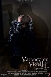
 We needed to convey these themes in our movie poster we had to do this using imagery mainly which was the convention that we saw a lot of other posters use. We used an image of the son kneeling up against a wall obviously scared we also had someone standing over him with an axe however it is unclear who it is helping to create ambiguity we also faintly show the text ‘I will bury you’ etched into the wall this helps to create tension in the image. We also keep the central theme of the demon by giving the son a catlike eye which helps to make him look less human. This helps to keep the themes we showed in the trailer and also to conform to convention where normally only one or two characters are shown in a poster and not a lot is said. These themes also help to ensure we appealed to our target audience.
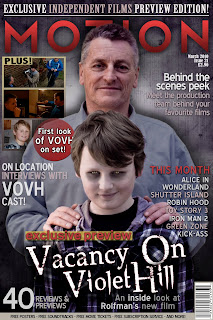
 We also needed to create these themes in our magazine front cover whilst also appealing to the target audience of the magazine. The target audience for a magazine is different to that of the film and we did extra research into this looking at other film magazines and what target audience they have and the conventions they used. In our research we noticed a lack of magazines covers with horror films on the front. We realised that this is because horror films have more of a niche audience and are not mainstream enough for larger magazines. We decided to then give our magazine a niche market which is British film lovers we did this by adding features about British films and independent films as well. This allowed us to give better reason for having our film on the cover because it is a British independent film. After identifying our target audience we got more of an idea about what to include on the cover. We realized that the image was central for the cover and we chose to use the same kind of themes as the poster. We took an image of a what looks like a family photoshoot with the father and son and whilst the father is smiling the son looks sinister and we give him a demonic face. This helps to keep the demon theme throughout all 3 products it also helps in making the reader curious.
We also included a house font seen in all 3 productions this allows us to keep a central theme and also helps the viewer or reader to identify between the three products. Overall our effective combination of all three products has helped us to create a well rounded media brand and keep the key themes obvious to any viewer or reader helping to identify more with the film.


No comments:
Post a Comment