This is the final cut for our trailer we modified based on the audience feedback we received.
Wednesday, 31 March 2010
4. How did you use media technologies in the construction and research, planning and evaluation stages?
In order for our group to produce the media project to the best of our ability .we used a variety of media technology including; Photoshop, adobe after effects and adobe premiere pro. We also used some very sophisticated filming equipment which josh reeves already had purchased for out of school purposes we took advantage of this in order to make the best media project we could. We used a Canon xm2 camera and a boom mike in order to help us get better sound quality.
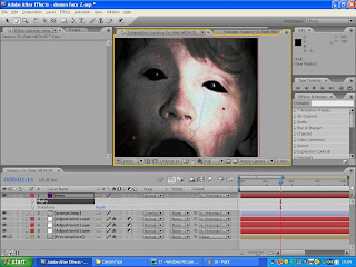 The most important piece of media technology we used was adobe after effects this helped the group to take the clips we filmed at the shoot and alter them so that they gave off the kind of tension we wanted to create in order to appeal to our target audience. After effects is a program designed to alter clips that we have filmed and add effects to them such as the demon face that you see at the end of the trailer. This made it a crucial piece of technology if we wanted to create the desired effect. This meant that if we did not have this technology then it would have been much harder for us to get the desired effect and would most likely have led to us having to change our strategy and come up with a new plot which would cater more to the technology we could use. After effects was another program that was owned by josh. Creating the demon was not the only use for after effects it also had another use and that was transforming the shots that were done in very low lighting and making it so that you could clearly see the face of the father when he is searching the house using the torchlight to illuminate his face. If we did not have the ability we would most likely have had to change our story to accommodate for only being able to film during the day. One of the key things we used in after effects was motion tracking this helped us to create our demon face because the tracking ensured that the effects that we applied to the face would follow it as the face moved forward in order to create the lunge effect. We also used after effects to create the production titles that you see at the beginning of the trailer these helped to add a professional look to our trailer and make it fell more like it could exist in the film industry.
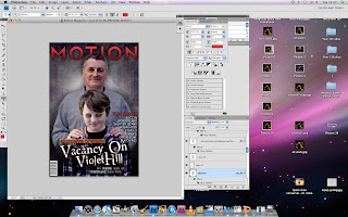 Another piece of crucial technology was Photoshop we used this in order to make our ancillary tasks which included a magazine front cover including our film and a poster for our film as I outlined earlier in the evaluation. Photoshop is a program designed to help the user alter still images to improve and add to them in order to get the desired effect. It is seen as industry standard in media and is used by a lot of media firms. Photoshop was key for our group because it helped us to make the best poster and magazine front cover using the variety of tools that are available on Photoshop. If Photoshop was unavailable then we would have had to use a different program in order to create our ancillary tasks for example Paint shop which does not have as many tools as Photoshop.
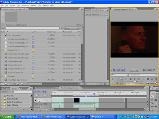 The other piece of technology that we used was adobe premier. This is primarily a program like final cut it is used to make small changes to clips such as changing the brightness of a shot. It is also used to take the clips and put them together making a coherent film also the group used it to add the copyright free music we had chosen in order to help to convey the theme and tension that we were hoping to create in the trailer. We also used it to combine all of the different sounds that we recorded as a wild track. Whilst adobe premiere was used to put our trailer together it would have been likely that we could have used final cut in order to put the clips and sound together. However premiere pro was useful because it linked nicely with adobe after effects making it easier to compile all of the clips and music.
 The most important piece of media technology we used was adobe after effects this helped the group to take the clips we filmed at the shoot and alter them so that they gave off the kind of tension we wanted to create in order to appeal to our target audience. After effects is a program designed to alter clips that we have filmed and add effects to them such as the demon face that you see at the end of the trailer. This made it a crucial piece of technology if we wanted to create the desired effect. This meant that if we did not have this technology then it would have been much harder for us to get the desired effect and would most likely have led to us having to change our strategy and come up with a new plot which would cater more to the technology we could use. After effects was another program that was owned by josh. Creating the demon was not the only use for after effects it also had another use and that was transforming the shots that were done in very low lighting and making it so that you could clearly see the face of the father when he is searching the house using the torchlight to illuminate his face. If we did not have the ability we would most likely have had to change our story to accommodate for only being able to film during the day. One of the key things we used in after effects was motion tracking this helped us to create our demon face because the tracking ensured that the effects that we applied to the face would follow it as the face moved forward in order to create the lunge effect. We also used after effects to create the production titles that you see at the beginning of the trailer these helped to add a professional look to our trailer and make it fell more like it could exist in the film industry.
 Another piece of crucial technology was Photoshop we used this in order to make our ancillary tasks which included a magazine front cover including our film and a poster for our film as I outlined earlier in the evaluation. Photoshop is a program designed to help the user alter still images to improve and add to them in order to get the desired effect. It is seen as industry standard in media and is used by a lot of media firms. Photoshop was key for our group because it helped us to make the best poster and magazine front cover using the variety of tools that are available on Photoshop. If Photoshop was unavailable then we would have had to use a different program in order to create our ancillary tasks for example Paint shop which does not have as many tools as Photoshop.
  The other piece of technology that we used was adobe premier. This is primarily a program like final cut it is used to make small changes to clips such as changing the brightness of a shot. It is also used to take the clips and put them together making a coherent film also the group used it to add the copyright free music we had chosen in order to help to convey the theme and tension that we were hoping to create in the trailer. We also used it to combine all of the different sounds that we recorded as a wild track. Whilst adobe premiere was used to put our trailer together it would have been likely that we could have used final cut in order to put the clips and sound together. However premiere pro was useful because it linked nicely with adobe after effects making it easier to compile all of the clips and music.
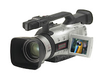
We used the camera and sound equipment to film and record the wild tracks that we needed for our trailer. This camera is different to the ones that were provided by our media teacher. Although the cameras provided by our media teacher are very good the camera available to us gave better quality and more options such as a manual focus system that can be used to perform focus pulls also the option to change exposure and other options which help to film at night. Below is a picture of the camera we used.

2. How effective is the combination of your main product and ancillary tasks?
For our main task we chose to create a film teaser trailer whilst we also chose to create a magazine front cover featuring the film and a poster for the film. In order to make an effective combination of our main and ancillary tasks we need to consider the different themes that we wanted to present in the trailer and convey them into our print product. It is hard to switch themes such as music from trailer to print so we decided to use imagery because we could easily achieve the same feel in a film and print when looking at imagery.
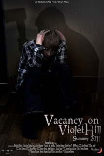 We needed to convey these themes in our movie poster we had to do this using imagery mainly which was the convention that we saw a lot of other posters use. We used an image of the son kneeling up against a wall obviously scared we also had someone standing over him with an axe however it is unclear who it is helping to create ambiguity we also faintly show the text ‘I will bury you’ etched into the wall this helps to create tension in the image. We also keep the central theme of the demon by giving the son a catlike eye which helps to make him look less human. This helps to keep the themes we showed in the trailer and also to conform to convention where normally only one or two characters are shown in a poster and not a lot is said. These themes also help to ensure we appealed to our target audience.
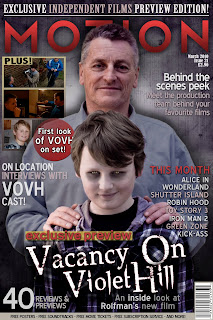 We also needed to create these themes in our magazine front cover whilst also appealing to the target audience of the magazine. The target audience for a magazine is different to that of the film and we did extra research into this looking at other film magazines and what target audience they have and the conventions they used. In our research we noticed a lack of magazines covers with horror films on the front. We realised that this is because horror films have more of a niche audience and are not mainstream enough for larger magazines. We decided to then give our magazine a niche market which is British film lovers we did this by adding features about British films and independent films as well. This allowed us to give better reason for having our film on the cover because it is a British independent film. After identifying our target audience we got more of an idea about what to include on the cover. We realized that the image was central for the cover and we chose to use the same kind of themes as the poster. We took an image of a what looks like a family photoshoot with the father and son and whilst the father is smiling the son looks sinister and we give him a demonic face. This helps to keep the demon theme throughout all 3 products it also helps in making the reader curious.
We saw it was important to ensure that our target audiences were the same between the three products so we decided to research into films that shared a similar target audience such as the grudge and the Amityville horror. We saw that they shared a similar target audience of teens through to young adults. We looked at the trailers for these films and clips from the films themselves. We also looked at the posters released with the films studying the conventions used in both. However there was a short supply of magazine front covers which showed horror films.
Our main product was a teaser trailer for the horror film ‘Vacancy on violet hill’. After researching forms and conventions involved in all films we studied horror films such as the grudge and the ring looking at the editing mise - en- scene lighting and much more. This helped us to understand what we needed to do for our trailer. We looked at all of these things and manipulated them to give of the theme and ideas we wanted to convey in our trailer. Some of these themes were tension curiosity and ambiguity.
 We needed to convey these themes in our movie poster we had to do this using imagery mainly which was the convention that we saw a lot of other posters use. We used an image of the son kneeling up against a wall obviously scared we also had someone standing over him with an axe however it is unclear who it is helping to create ambiguity we also faintly show the text ‘I will bury you’ etched into the wall this helps to create tension in the image. We also keep the central theme of the demon by giving the son a catlike eye which helps to make him look less human. This helps to keep the themes we showed in the trailer and also to conform to convention where normally only one or two characters are shown in a poster and not a lot is said. These themes also help to ensure we appealed to our target audience.
 We also needed to create these themes in our magazine front cover whilst also appealing to the target audience of the magazine. The target audience for a magazine is different to that of the film and we did extra research into this looking at other film magazines and what target audience they have and the conventions they used. In our research we noticed a lack of magazines covers with horror films on the front. We realised that this is because horror films have more of a niche audience and are not mainstream enough for larger magazines. We decided to then give our magazine a niche market which is British film lovers we did this by adding features about British films and independent films as well. This allowed us to give better reason for having our film on the cover because it is a British independent film. After identifying our target audience we got more of an idea about what to include on the cover. We realized that the image was central for the cover and we chose to use the same kind of themes as the poster. We took an image of a what looks like a family photoshoot with the father and son and whilst the father is smiling the son looks sinister and we give him a demonic face. This helps to keep the demon theme throughout all 3 products it also helps in making the reader curious.
We also included a house font seen in all 3 productions this allows us to keep a central theme and also helps the viewer or reader to identify between the three products. Overall our effective combination of all three products has helped us to create a well rounded media brand and keep the key themes obvious to any viewer or reader helping to identify more with the film.
3. What have you learned from your audience feedback?
Audience feedback was a very important and helpful tool because it allowed us to:
• Improve our teaser trailer and print production titles.
• Discover how our media product relates t our target audience.
• Identify if our product has the intended effect upon our target audience.
There were two types of audience feedback that we used these were formal and informal. For formal we used a questionnaire with quantitative and qualitative. Informal was more feedback that we got as we went along from our teacher and peers. Whilst we can easily quote the formal feedback we did not record our informal feedback.
The earliest formal feedback was a questionnaire that we handed out to five different people in our target audience and asked them to comment on our rough cut. As I said before we included qualitative and quantitative questions so that we had a combination of stats and opinions. These stats helped us to realise trends in filmgoers. We also realised that the ending to our trailer needed a lot of work because the tension levels were only rated on average at 5. Also people said that they were not interested in our film this worried us.
below is the feedback sheets we received for our rough cut.
Audience Feedback Rough Cut
We also included a constructive criticism question to see where we were going wrong and a lot of people wrote that the scare at the end was too obvious and no tension was created. We knew that we needed to change the ending because of this so we re-filmed it and re edited it. We also included some more scary music from a copyright free CD.
These improvements were reflected when we showed the final cut to ten people and had them fill out the same questionnaire. We got much better feedback with the tension levels much higher and a lot less constructive criticism. We also saw a marked improvement in interest in the film as nearly everyone wanted to see the film apart form someone who did not watch horror films anyway. We also saw that we were appealing to audience expectations from the answers given to the questions. For example ‘How did you feel after watching the trailer?’ “Uncomfortable and wanting to know the whole story.” – Sam Avery
below is the feedback forms we got for the final cut.
Audience Feedback Final Cut
We also asked some people to fill out questionnaires for our ancillary tasks and we received positive feedback on both our poster and magazine cover. We got answers such as “The poster looks professional and as a horror fan I would posses interest in the production if it were real.” However most of the feedback we received was informal form peers and such who saw it during the production process and helped us to steer it in the right direction.
As a group we realise that audience feedback is essential especially if you are making a product, which needs to appeal to a specific target audience. It helped us to improve all three of our products.
Tuesday, 30 March 2010
Using premiere and after effects
This is a small overview of how we used adobe after effects and premier pro made by josh reeves
Constructing the Teaser Trailer
Constructing the Teaser Trailer
Production titles
I have not included a construction for the production titles as i played no part in them. They were done whilst i was doing research so that we could keep to time.
Subscribe to:
Posts (Atom)

